

Simplifying Appointment Booking with Material Design and F-Pattern Principles: A 40-Minute UX/UI Case Study
In today’s fast-paced world, convenience is king. People are constantly seeking ways to save time and effort, and this extends to mundane tasks like scheduling appointments. Online appointment dashboards have emerged as a popular solution, but not all dashboards are created equal.
I decided to conduct a 40-minute UX/UI case study on an online appointment dashboard that I found online. My goal was to identify areas for improvement and recommend changes that would enhance the user experience. This was done with just the one visual of the current dashboard without any user-centric-data or research information. Normally this process would start with requirements and user insights but it is a interesting case study to apply UX/UI thinking.
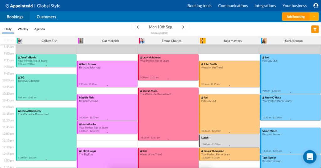
Current booking dashboard (Appointedd)
Material Design and F-Pattern Principles
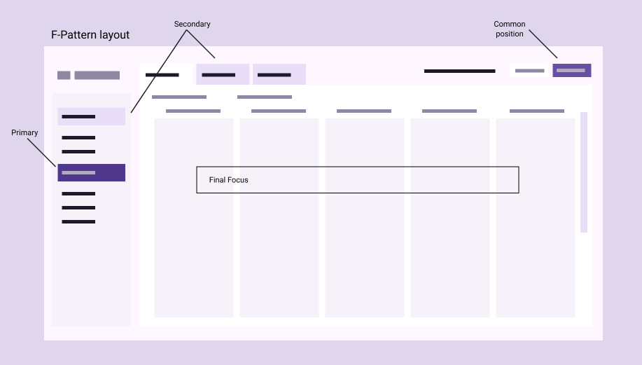
During my analysis, I drew inspiration from two well-established design principles: Google Material Design and F-Pattern.
Material Design, developed by Google, is a comprehensive set of guidelines for creating user interfaces that are intuitive, beautiful, and accessible. Its principles emphasize the use of grids, spacing, and colour to create a sense of order and hierarchy.
The F-Pattern, based on eye-tracking studies, describes the natural way that people scan digital content. It suggests that users tend to focus on three horizontal lines: the top, the middle, and the bottom of the screen. They also pay attention to a vertical line along the left side of the page.
Identifying Areas for Improvement
After applying these principles to the appointment dashboard, I identified several areas for improvement. These included:
- Lack of clear hierarchy between elements.
- Difficult-to-use call to actions
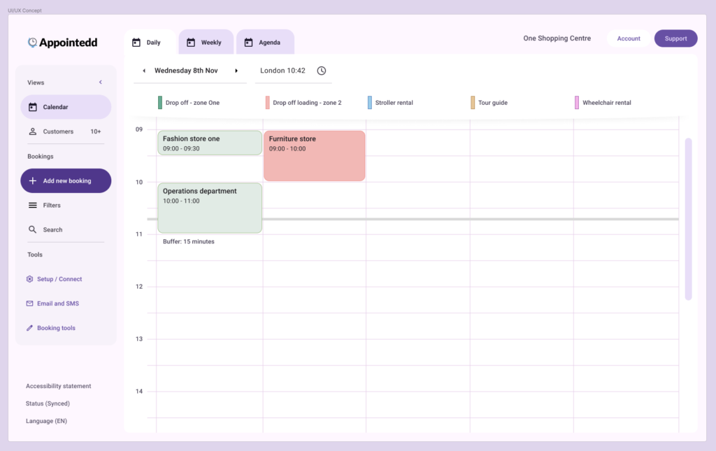
Implementing Changes
Based on my observations, I recommended a series of changes to the dashboard. These changes aimed to:
- Improve the visual hierarchy of the dashboard.
- Make the interface more intuitive and user-friendly.
- Make more accessible
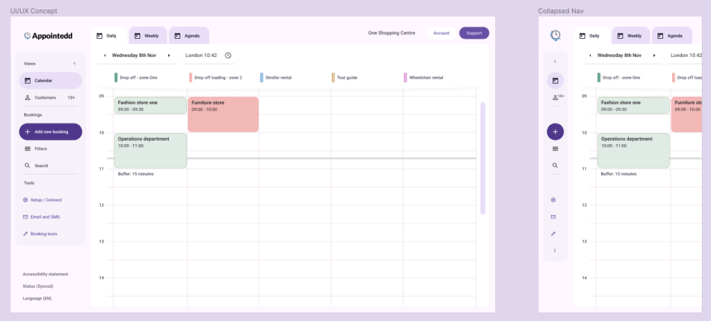
Once users are familiar with iconography and positions they can collapse the primary navigation to improve focus on the bookings:
After implementing these changes, I conducted a fast follow-up usability test with three participants. The results were overwhelmingly positive. Participants were able to understand the dashboard and navigation more quickly and easily when asking about task call to actions, and they reported feeling more satisfied with the overall experience.
Conclusion
This case study demonstrates the power of applying well-established design principles to improve the user experience of online appointment dashboards. By following Material Design and F-Pattern principles, designers can create interfaces that are not only visually appealing but also easy to use. This was a 40 minute case study so would evolve as testing and research is integrated and scenarios of task flows added.