En
Aegon UK Public User Experience
Designing an audience-centric vision and a more digitally focused business.
The challenge
Aegon are a leading provider of pension, savings, and investment solutions. Its existing legacy websites struggled to deliver clarity to their users as well as lacking brand consistency, personalisation, and best practice aspects of UX, SEO and usability.
This was impacting business success and as such Aegon needed a new website to provide a single, cohesive public facing experience to replace the existing sites, which were on a tangled architecture, three legacy platforms and led to confused and frustrating customer journeys.
This project represented a shift towards a more user-centered approach. Rather than the typical ‘spec & outsource’ model with internal IT and a system integrator, Aegon established an internal project with a dedicated UX Design lead. This focus on in-house UX expertise ensured users remained a top priority throughout the process. We then partnered with an external agency (Positive) for design and development. This collaborative approach fostered open communication and ensured a fully aligned solution that met both user needs and technical requirements.
The Problems:
- It was difficult for users to find the right website when there was three sites and multiple customer type content within
- User were finding it hard to find the right support and login/activation for their products and services.
- User were having to phone customer services to request for support on common issues
- When they did call it was to the wrong number/ department that caused frustration when they were already having negative emotions.
- Advisers were having a difficult time finding technical documentation
Positive
Customer feedback
across the journeys
-25%
Customer support calls
on common requests
30
Journeys and tools optimised
for the user experience
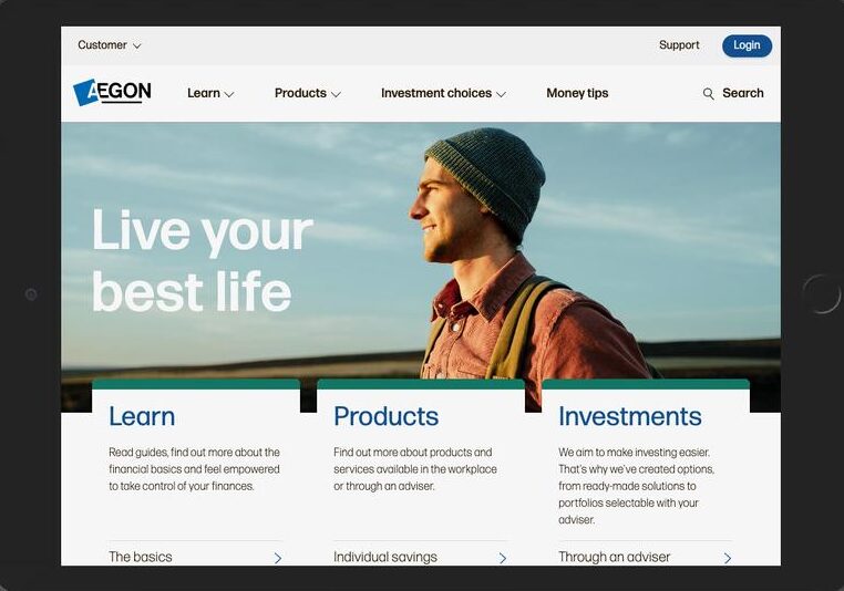
The team crafted a solution to consolidate the three disparate sites and unify audience-specific and proposition-relevant user journeys, to merge the experience into simplified experience that focuses on product support and knowledge.
I designed a best-in-class system and guided login/support feature helping users explore and access content and, directs the user to the correct target platform (of the many available) to ensure visitors see content relevant to their products and propositions as well as easily guide them to self-serve support and the new secure portal to login via a cohesive UX.
User-Centered Design:
My Contribution as Lead UX Designer
As the Lead UX Designer for this project, I spearheaded the user experience (UX) strategy for the new public website. My focus was on ensuring a seamless and intuitive experience for all users, while aligning the website with the organization’s broader design language.
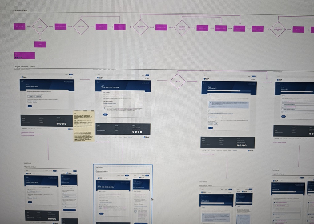
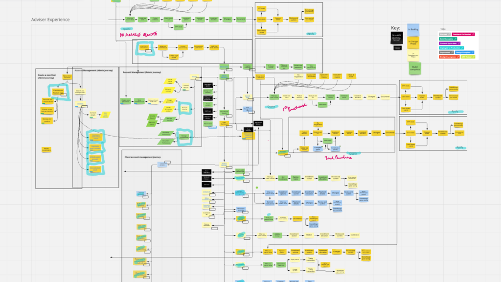
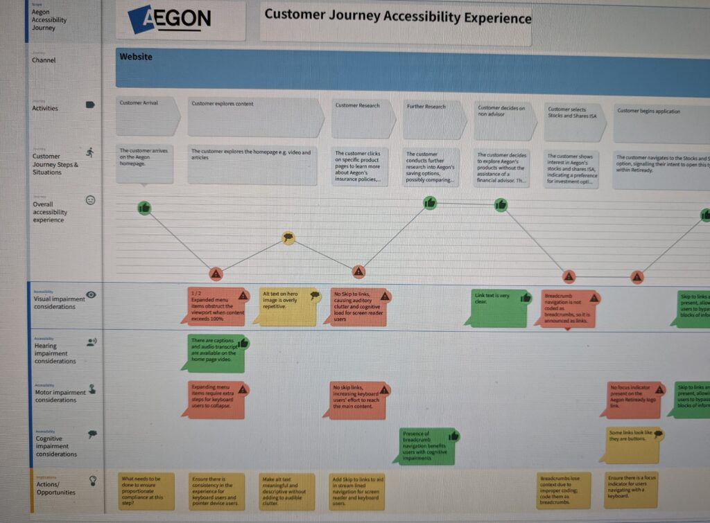
User-Centered Approach: To gain a deep understanding of user needs and behaviours, I created detailed user journey maps. These maps visualized the entire user experience, from initial website discovery to accomplishing their desired tasks. This user-centered approach informed the design direction and ensured the website catered to the specific needs of the audiences (Customers, Employers and Financial Advisers).
We created surveys and had interviews with customers to understand their pain points and needs.
Building a Unified Design System: I played a pivotal role in shaping the website’s design system. This system ensured consistency across the website and other Aegon digital touchpoints, creating a unified brand experience for users. My work involved defining user interface (UI) elements, interaction patterns, and accessibility guidelines, providing a clear foundation for the development team. It was found that users needed consistent navigation and support during public and secure engagement.
Beyond Public UX: Empowering Internal Teams: This project wasn’t solely focused on the public user experience. Recognizing the importance of internal users, I championed the design of a user-friendly Content Management System (CMS) experience for digital asset managers, CMS authors, and digital stakeholders. Through user collaboration, testing, prototyping, and iterative refinement, through a design process, custom workflows and reporting models with designed with the web team and wider stakeholders. This transformation enabled a significant decentralization of content management, scaling from just 8 users to a successful system supporting over 300. By optimizing internal processes and prioritising a user-centered approach for both internal and external stakeholders, this project massively improved overall user experience across the board.
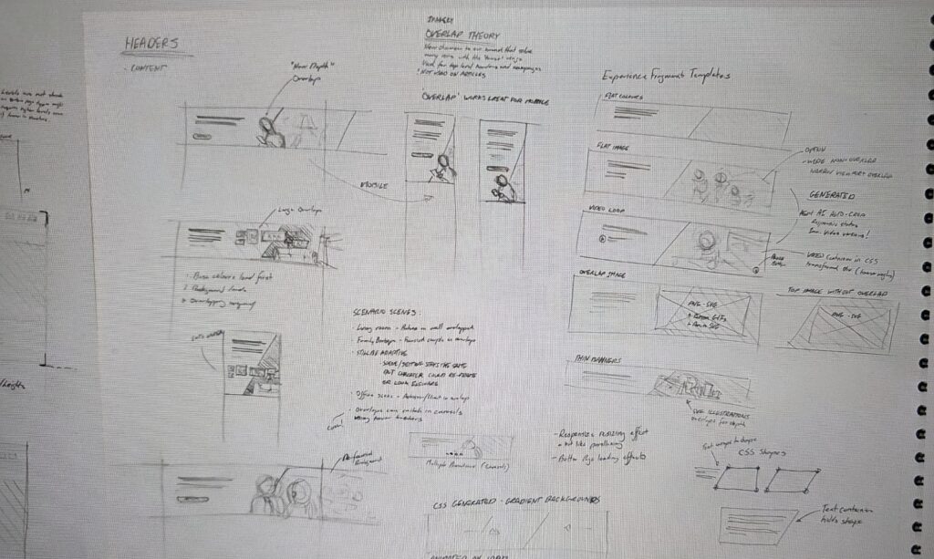
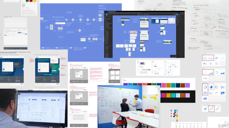
Iterative Design & Collaboration: I utilized various design methods throughout the project, including sketching, information architecture mapping, and prototyping. These techniques facilitated effective communication and collaboration with stakeholders and developers. Additionally, I led user testing session briefing and analysis, where real users interacted with prototypes, providing invaluable insights that further refined the design.
Positive Third-Party Collaboration: One of the project’s highlights was the successful collaboration with a third-party design and development team. My focus on clear communication and shared goals fostered a productive partnership. We worked seamlessly together, ensuring the final website met both UX and technical requirements.
By taking a comprehensive approach to UX design, I played a key role in creating a user-friendly and visually appealing website that serves the needs of all Aegon customers. This project showcased my ability to not only lead the design process but also foster productive collaboration across teams for a successful outcome.
Your expertise and often long, unsociable hours throughout the project are greatly appreciated. Your huge personal contribution has helped us deliver a market leading website that delivers a significant step change in user experience and unlocks growth opportunities for our business. I’m personally grateful for your support you’ve given me and your laser focus on quality and innovation and above all else demonstrating great positivity.
Kevin Carter
/
Head of Brand and Marketing Operations, Aegon UK
“Thank you for all your hard work to transform Aegon’s digital experience for our customers, advisers and importantly, for our internal teams in architecting such a usable system for our new website.
Andy Manson,
We hugely value the fresh, strategic thinking and quality of work you have brought to the project – and indeed to deliver it with such a strong sense of a unified team between Aegon and agencies.
You have provided elegant, creative solutions to complex challenges with a rare clarity of thinking. Swift to deliver, you have brought us immense value in delivering such a positive outcome and a digital experience that we are truly proud of and will be the foundation for the business’ digital transformation for years to come.”
/
Chief Marketing Officer, Aegon UK
The solutions
There was a large amount of change done over a 24 month project for the public experience and has a continues optimisation roadmap to extend it further:
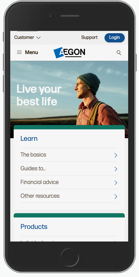
- Reduced the noise: The project reduced the public estate down to one website with 3 specific flows (Customer, Employer, Adviser) that allowed clear messaging and navigation. This improve first-connecitons (Search engines) and removed mixed messaging. The new site was optimised for mobile and tablet as our customers were using these devices more than desktop systems.
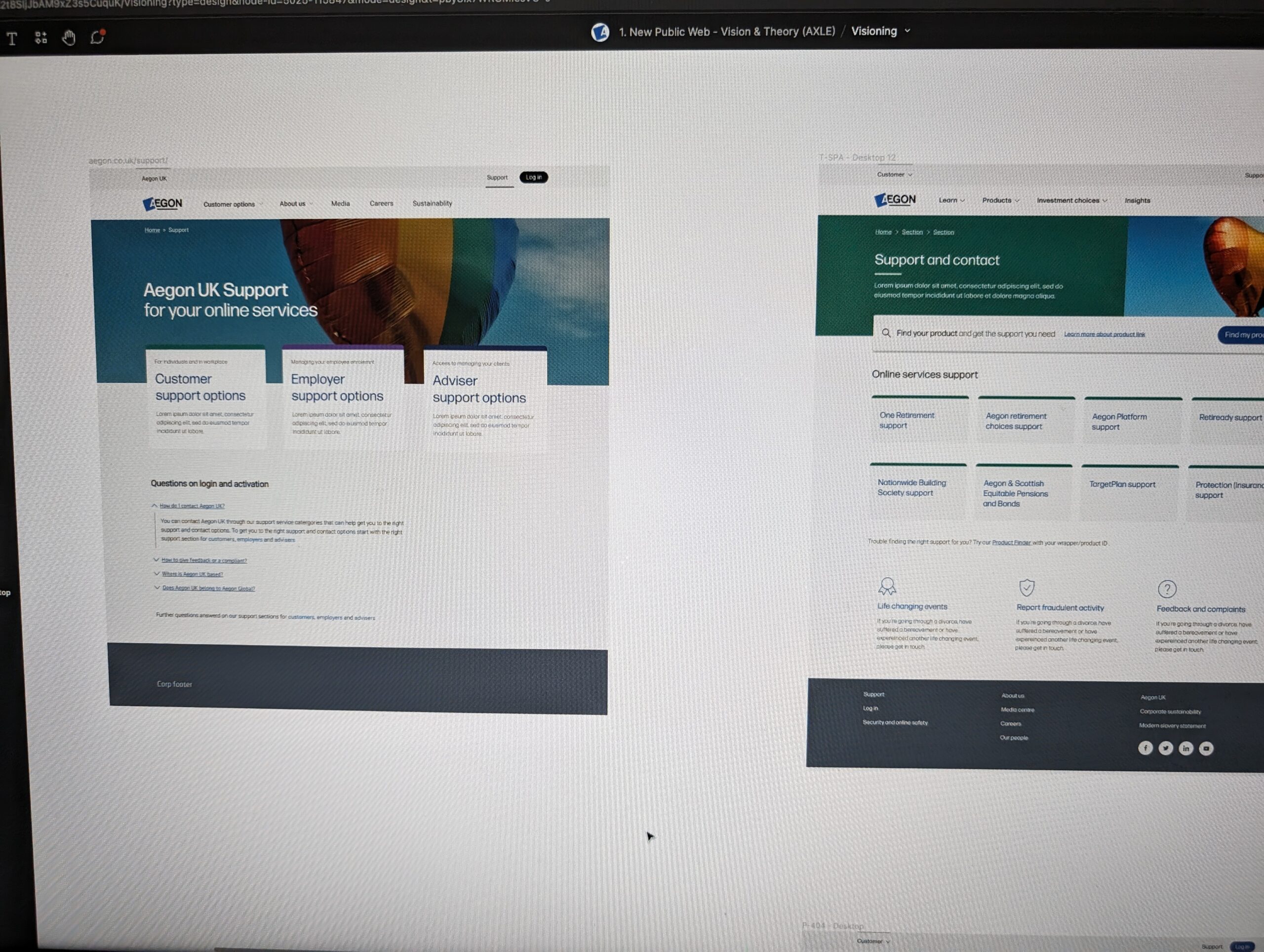
- Levelling up support: The website had a self-service model introduced but with the right level of layers for vulnerable customers and users that prefer calling. The design allows users to find their products and services via a wrapper ID look up (Product Finder) or wizard process allowing them to find thier tasks quicker. This is the future is to be replaced with a consolidated support and login solution.
- Getting connected: As the journeys were far more optimized for the user types, when they did need to call, they were directed to the right contact details first-time and also we found that a lot of our direct customer groups preferred web chat so that was implemented within contact journeys above phone numbers.
- Technical solution: The project delivered a new way for advisers to search for technical documentation with categorisation and global search. We also found that the support journey from customer services also required deep-linking so they could direct advisers to documents without placing them into an email chain.
- Emotional difference: As part of the solutioning there was also a shift in photography with the help of the UX team so that the site enhanced user’s emotions in a positive direction.
A lasting impact
This project’s success extended beyond the launch of the public website. Here are some of the lasting positive impacts:
- Validation of Agile Design: The project served as a strong case study for the effectiveness of Agile design methodologies. By iteratively incorporating user feedback throughout development, we achieved a high-quality user experience within a flexible timeframe. This success story has encouraged wider adoption of Agile methodologies within the organization.
- Continuous Optimization: The website is designed for ongoing improvement. We continue to conduct user testing and journey mapping exercises, identifying areas for further optimization. This commitment to user-centered design ensures the website remains relevant and effective in the long term.
- Strong Foundation for the Future: This project established a robust and scalable foundation for future website development. The well-defined design system and user-friendly CMS empower future development teams to deliver high-quality website experiences efficiently.
- Elevated Importance of UX Design: The project’s success significantly increased awareness and appreciation for UX design within the organization. Stakeholders witnessed firsthand the positive impact of prioritizing user needs as we could show the outcomes of the work and not just assumptions. This project has paved the way for a more user-centered approach across future initiatives.
- Collaboration: Key to Success: Throughout the project, we emphasized the importance of collaboration across disciplines. The seamless partnership between UX, development, and stakeholders was instrumental in achieving a successful outcome. This project serves as a model for future collaborations, highlighting the power of teamwork in maximizing project impact.
